Controlled Color: How We Framed the Chaos in Chris Marmier’s “Priority”

What do you do when the artwork already brings the energy? You frame it, you don’t fight it.
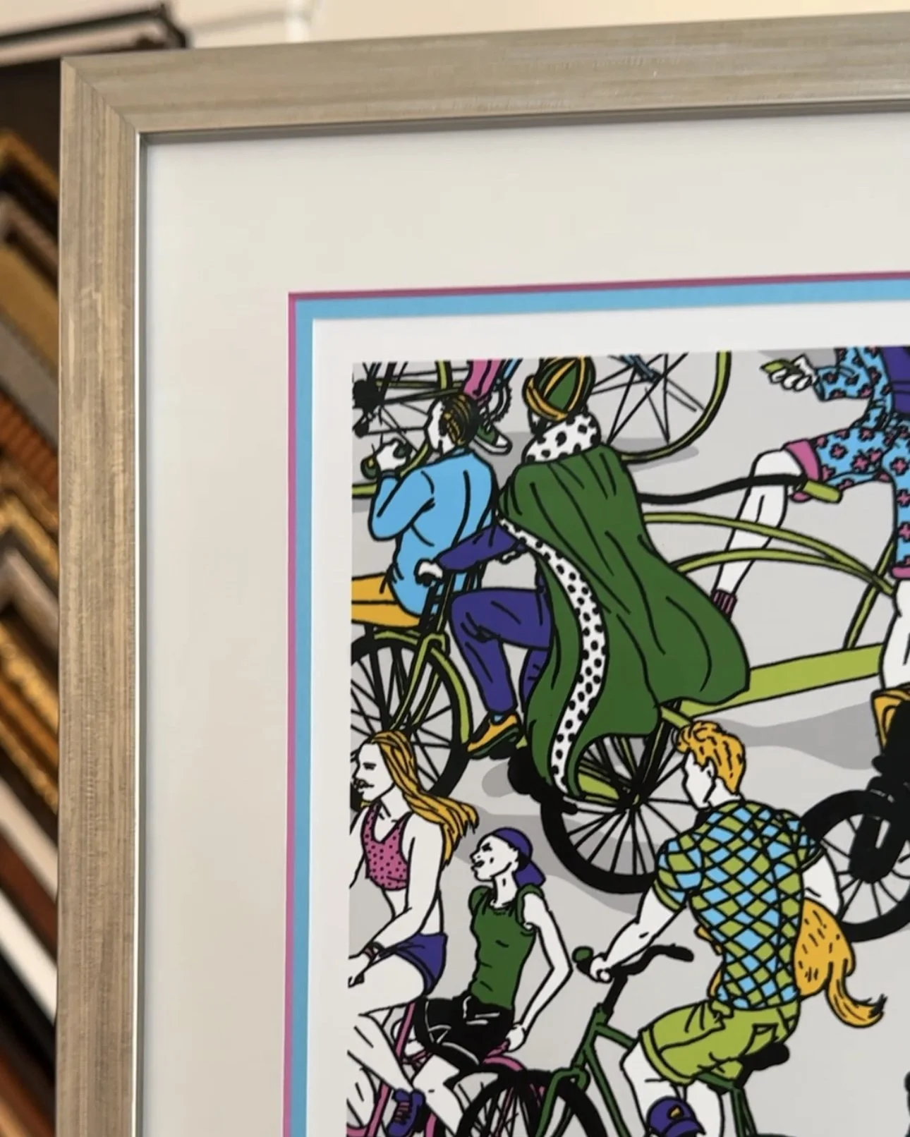
That was our design philosophy for this limited-edition lithograph by Chris Marmier—an artist known for capturing the vibrancy of urban life through tightly packed, colorful scenes filled with personality and movement. His work resonates not just with European cities, but with the buzz of San Francisco itself: packed bike lanes, friends on sidewalks, people with their dogs, all colliding in organized chaos.
We wanted to honor that energy—but not compete with it. So we chose a triple mat design with ultra-tight reveals—showing only a whisper of each layer’s color. Just enough to accent without overwhelming. Think of it like letting just the right amount of street noise into a quiet apartment—you get the feeling without losing the calm.
To complement the palette and elevate the tone, we used a Champagne-toned wood frame: soft metallic, understated, modern. It gives the whole piece a refined edge, like a gallery-hung print in a downtown loft.
Finally, we sealed it with UV-filtering conservation glass, because when a piece has this much color and movement, it deserves to be preserved—so the vibrancy stays long after the summer fades.
Have a print that’s buzzing with life? Come see us in the Castro—we’ll help you design a frame that enhances the story without stealing the spotlight.